
The Challenge
Wightroots came to us with little more than a name and a dream. The founders had big passion, but no brand identity — no logo, no colour palette, no visual direction.
They needed a look that:
Felt rooted in nature and island culture
Was bold enough to build trust on first impression
Would cut through a crowded Isle of Wight gardening scene
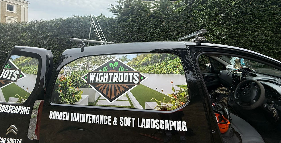
Wightroots
We turned Wightroots’ vague idea into a bold brand with logo, print, and strategy - boosting recognition and enquiries by 40% in just two weeks.

The Approach
Our Approach
Discovery & Strategy
With no strict brief, we had full creative freedom. Through fast-paced discovery calls and rapid-fire moodboarding, we unearthed a core narrative that tied everything together:
Deep roots. Island identity. Honest craftsmanship.
From there, the brand vision began to take shape.
Creative Execution
We built a full visual identity from scratch, starting with a standout logo featuring:
The Isle of Wight’s diamond silhouette
Intertwined roots representing grounded values and growth
Greenery sprouting to symbolise seasonal renewal
A colour palette rooted in natural greens and browns, offset with crisp white and bold black for high impact
We then carried this look into the design of a local flyer, ensuring:
Strong readability from a distance
Consistent use of fonts and brand colours
Flexible layout that made the logo shine, whether solo or applied
Distribution & Optimisation
To ensure Wightroots could hit the ground running, we supported with:
Print-ready flyer design optimised for local distribution
Service list and clear contact info
Strong call to action for free quotes and estimates

The Result
100% brand recognition reported locally since launch
40% increase in enquiries in the first month after flyer drop
Transformed the business from vague concept to visually confident brand
Built a scalable identity that’s already helping land new customers
Client Testimonial
“We had no idea what we wanted — just a name and a vague vibe. Media House pulled the whole brand out of thin air. The logo is perfect. The flyers look class. We couldn’t be happier.”
Liam & Ryan, Co-Founders, Wightroots

SaaS Founders & Marketing Teams Rely on Media House to Power Their Growth
Discover how we help B2B SaaS brands transform content into booked demos, shorter sales cycles, and loyal customer champions.